-
Gorgeous New Yahoo Screen App Showcases Innovation in Mobile Video Experiences
Mobile is emerging as the locus of innovation in the video user experience, with yesterday's unveiling of the new Yahoo Screen app as the latest evidence. Content providers appear to have realized that the tablet, in particular, offers a new navigation canvas that enables elegant design and graphics with intuitive touch-based interactivity. Combined, the user can be immersed in content to an unprecedented level.
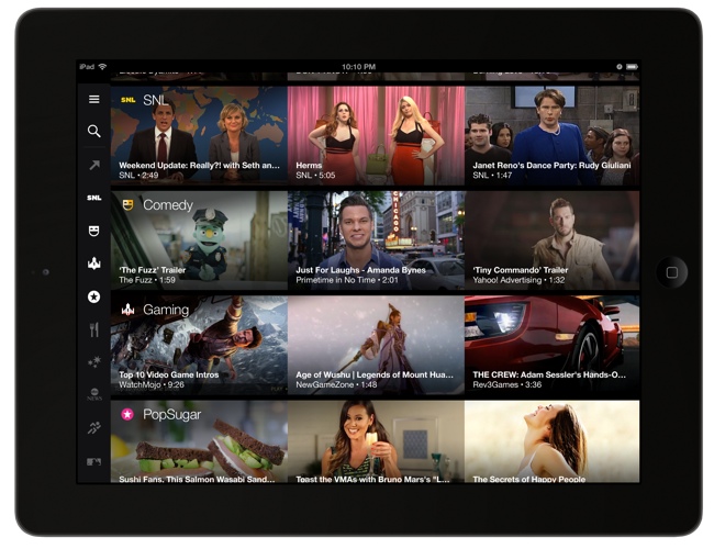
Yahoo Screen is a perfect example of this phenomenon. Content is presented in a 3x4 tiled window with the ability to quickly scroll down or across for additional choices (see below). Each tile consists of a hi-res thumbnail with the episode title, series name and duration. Upon clicking a tile the video begins playing immediately after a nice little dissolve intro effect Yahoo has created. You can exit the video and return to the main tiled screen by touching a 4 squares icon that's persistent in the upper right of the video window.
The channel selection in Yahoo Screen includes the huge trove of SNL clips Yahoo has exclusively licensed, highlights from The Daily Show and The Colbert Report (from a new deal with Viacom), Yahoo's own slate of originals, news from its partnership with ABC News, clips from Conde Nast publications (Vogue, GQ, Wired, M) plus The Onion and miscellaneous sports clips. One particularly elegant design touch is that the icons for each of the channels brightens and dims as you scroll vertically through the channels.
By cleverly integrating well-known branded channels with its own lesser-known originals, Yahoo Screen continually, but subtly, pulls users past these choices, giving them visibility and helping build audience over time. Yahoo Screen also offers the ability to autoplay videos in a linear manner, in which case a curated playlist that mixes brands and originals runs for a lean-back experience. There is also quick navigation to Yahoo's other mobile apps for mail, sports, weather, Flickr, etc. via a left side slide-out. While I didn't see any ads, Yahoo said both pre-rolls and display will be included.
Yahoo Screen is the latest in a growing list of distinctive mobile apps that are re-setting users' expectations for how to engage with video, minus the TV and its traditional remote control. On my personal "best" list of mobile video apps currently are Netflix, TiVo, WatchABC, WatchESPN, HBO GO and VEVO TV. It's worth noting that great experiences drive higher usage: just yesterday VEVO revealed a 184% year-over-year growth rate in monthly mobile views, with an astounding 50% of all U.S. views in June happening via mobile devices. Great mobile video experiences also seem to lead to better monetization; yesterday I reported on new TubeMogul data showing an 8x improvement in CTR on mobile vs. online.
Last but not least, while these mobile video apps are all terrific on the tablets themselves, they also provide a gateway for breakthrough TV experiences. In particular, integration with Chromecast means that the full app experience can be "cast" easily to the big screen, with familiar navigation remaining on the mobile device. In short, as powerful as these mobile apps already are on mobile devices, the best may yet be ahead, when they potentially become the de facto TV experience as well.
Categories: Devices, Mobile Video
Topics: Chromecast, Viacom, Yahoo, Yahoo Screen

