-
Comcast/Fancast, Hulu and the Role of Great Execution, Part 2
A couple of weeks ago in "Hulu Out-Executing Comcast in On-Demand Programming?" I took Comcast's Fancast to task because Hulu was first to implement its deal with Comedy Central for full episodes of "The Daily Show" and "Colbert Report." It was a missed opportunity for Fancast, which had previously announced a deal with Comedy Central for these shows. Hulu gained a bonanza of favorable press attention, likely spiking its usage.
Well fair is fair and so I'm now happy to report that Fancast has also posted these programs. But at the risk of sounding like a Fancast scourge (which I'm really not trying to be) Hulu continues to distinguish itself with a superior user experience. For those looking to succeed in broadband video the execution differences between these two sites provide key lessons.
First, after searching for The Daily Show on Hulu, the site automatically displays the most recent episodes first (beginning with last night's episode). When starting the player, Hulu's quick 7 second "brand slate" runs and then the program starts. This emphasis on a quick payoff no doubt reflects lessons Hulu's CEO Jason Kilar learned from his years at Amazon, which, like all great e-commerce sites knows that a distraction-free checkout process results in more completed transactions.
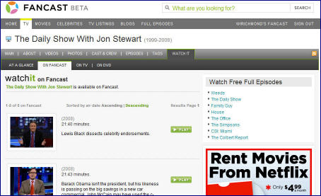
Conversely, at Fancast, after doing a search for Daily Show, the results are "Sorted by air date Ascending | Descending." Ascending is pre-selected, and the first episode shown is from April 9th, with Lewis Black. Huh - why such an old episode being shown first by default? And is the average user really going to be familiar with these sorting terms? Why not just offer choices like "Newest" and "Oldest" with "Newest" as the default?
When I tried watching several episodes I encountered more distractions and inconsistency. I alternatively saw a 30 second pre-roll, a 15 second pre-roll and once I even got back-to-back 15 second pre-rolls (of the same A1 steak sauce ad no less). Contrast this with Hulu where each time I knew to expect the voiceover intoning "The following program is brought to you...." Hulu understands that positive online experiences emphasize usability and consistency.
Separately, Hulu offers the ability to send a link to the full episode to a friend or clip just a segment, which can also be posted easily to a number of social networking sites. The features worked flawlessly and when done the video resumed playing automatically. On the other hand, an envelope icon at Fancast reveals 2 sharing options, "Beginning of Video" or "Current Scene." Yet after clicking on both they seem to reveal the same screen. So what's the difference? Worse, after finishing up sharing, the video was frozen, forcing me to close the browser and start all over again. Ugh.
Just to be clear, I don't expect perfection and I do recognize that Fancast is still in beta. To put all this in some context and explain why I'm dragging you into the weeds with this part 2 post, I've long believed that broadband's openness will allow new aggregators to emerge, attempting to compete with incumbents like cable and satellite operators. Differentiating themselves is no small feat considering, as in this case, the underlying content they have will likely be similar to what's available elsewhere.
Hulu is differentiating itself through great execution - particularly noteworthy for such a young site. My
 guess is that execution and usability DNA run very deep within the Hulu team. On the other hand, Fancast has not yet demonstrated comparable execution mastery and as a result is leaving the competitive door ajar for its customers to give Hulu a try. Winning Hulu users back to Fancast will be tougher than winning them now.
 Broadband aggregation is going to be a battleground with big eventual payoffs. As a powerful incumbent, Comcast must do everything possible to preclude users from seeking out Hulu and other aggregators. (Truth be told, it is unlikely these broadband aggregators would have raised close to the $366+ million I recently reported in the first place had Comcast and other incumbents proactively seized the online aggregation space several years ago. But that's a story for another day.)
For all the time I spend talking about strategy at VideoNuze, I've always been a big believer that competition is mostly won in the trenches. That's especially true in online where great execution and usability separate winners from the rest. For Comcast, the competitive bar is far higher than it has ever been. To succeed, it must significantly improve its execution.
Categories: Aggregators, Cable Networks, Cable TV Operators


