-
Vevo Launches: Decent Start, Lots of Work Ahead
Vevo, the much-heralded "Hulu for the music industry" venture backed by Universal Music Group, Sony BMG, Abu Dhabi Music Company and Google/YouTube (and with video provided by EMI as well) officially launched late last night. I've been browsing around the site this morning and my first reaction is that it's a decent start, but has a long way to go if it is to fulfill its lofty mission.
Conceptually, I like the idea behind Vevo. The music industry, which has suffered multiple blows over the last 10 years, is getting together to create a destination site where music videos are distributed legally, with a coherent ad strategy. YouTube's participation means that videos that have been watched in the labels' YouTube channels can be branded Vevo, giving the new site tons of visibility, and helping migrate traffic over time.
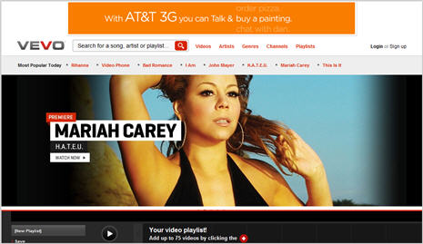
From a design standpoint, the Vevo site has a similar feel to Hulu: large, wide-screen images on the home page promoting certain videos/artists, thumbnails below, of top videos, playlists and artists, quick links to most popular today, and search/navigation. A nav bar at the bottom of the screen invites users to easily create new playlists by adding up to 75 videos with one click. Videos are embeddable and shareable, and there are quick links to buy the music at Amazon and iTunes. The site was periodically very slow to load and occasionally even gave me a server error page. I don't know how much of this to ascribe day 1 hiccups that will be worked out over time or really poor capacity planning.
Less clear to me is how Vevo distinguishes itself from a user experience standpoint from YouTube itself. This has been a question that's nagged at me since the Vevo concept was first unveiled - how do the partners plan to make 1+1=3? The partners have made references to being indifferent to whether users watch at Vevo.com or YouTube, presumably because there would be similar advertising on both with similar splits. Yet, my experience going back and forth between the sites, albeit very limited, reveals lots of inconsistencies and a lot of promotional leverage left untapped.
Focusing on U2, one of my personal favorites, I found only about a dozen of the band's music videos on Vevo. Switching over to YouTube, I found many more tracks, such as "Beautiful Day," "I Still Haven't Found What I'm Looking For" and "Where the Streets Have No Name," all in the Universal Music Group's channel. All of the videos were monetized: the first was preceded by a 15 second pre-roll ad for Chevy Malibu and the latter two carried an overlay ad to "Play Free Games" which was accompanied by a companion ad in the right column (the overlay was incredibly distracting, but that's another story). None of the videos had any Vevo branding whatsoever. It's also worth noting that even the UMG channel in YouTube has no Vevo branding or promotion.
Conversely, a search in YouTube for "All Because of You," a video that is available on Vevo, loads in YouTube with full Vevo branding. Above the video window are options to "Watch with Lyrics," "View Artist Profile," and "Create a Playlist." Clicking on any of these carries you over to the Vevo site. However, none of these actions are well-executed. "Watch with Lyrics" restarts the video, whereas a much slicker implementation would resume playing on Vevo from the point of drop-off. "View Artist Profile" simply displays a list other videos available, without any real artist profile information offered (background, upcoming concerts, etc.). And "Create a Playlist" just brings you to Vevo's home page, without any prompts for what to do next if indeed you want to actually want to create a playlist.
Elsewhere, the Vevo team hasn't even bothered to update its blog to officially announce the site's launch (it still says "Launching Tonight!" at the top). That's a missed opportunity, especially considering there was a splashy launch party in NYC last night (attendees ranging from Google's Eric Schmidt to Rhianna, Bono and Mariah Carey) and pictures and video from that event would have been a big drawing card. Come on - where's the Vevo PR team here?
How much of this should be forgiven to it being early days of Vevo's launch is a subjective call. From my vantage point though, I think the Vevo team could have done a lot more to think through and execute on the user experience. Back in November '07, when I looked at Hulu in its private beta, I gave it a solid B+. The Hulu team had clearly obsessed about each and every detail of the site - and have continued to do so. Hulu's user experience isn't perfect, but it has set the bar very high for those seeking to emulate it. For now Vevo probably rates around a C; much work is still ahead.
What do you think? Post a comment now.Update: Vevo's blog post that "It's awesome that millions of people are checking it out, but the response has been orders of magnitude larger than even our highest estimate" suggests poor capacity planning by the Vevo ops team. I mean,"orders of magnitude larger"? If that's really the case then the ops team gets serious demerits for a ridiculously big miss.Categories: Aggregators, Music
Topics: EMI, Google, Sony BMG, Universal Music, VEVO, YouTube
Posts for 'VEVO'
Previous |


