-
Hulu 1.0 Gets a Solid B+
I'm now back from Digital Hollywood and I've had an opportunity to give Hulu 1.0 a spin as part of its private beta. I've also looked the Hulu offering at AOL which is not yet comparable (less content, fewer features) to the one at Hulu.com. So I think that for now using Hulu through the private beta is the only way to get the full 1.0 experience.

My initial reactions are positive and I give Hulu 1.0 a solid B+, with many of the fundamentals well done, but with certain features needing improvement, as to be expected from a beta launch. All in all, considering the short development window in which Hulu was created, the Hulu team deserves much credit.
Hulu 1.0 should more than silence those who snarkily pre-labeled it "Clown Co" and misunderstood it to be a "YouTube killer", which it is not. Hulu has not embarrassed its primary investors (and content providers) NBC and News Corp in any way, and in fact, has set the stage for taking back control of how its full-length content and clips are distributed online. This was of course the investors' main motivation - creating a legitimate platform for them to control their online destiny and capture the lion's share of the economics.
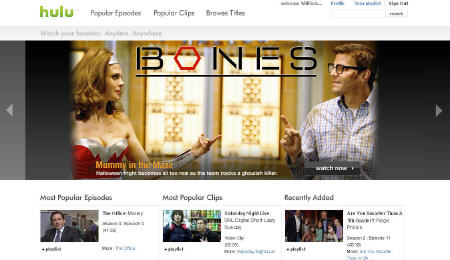
Design and Video QualityHulu sports a clean, open design format, heavy on thumbnail images. It's easy to find your way around, and there's little risk of getting lost in the process. The home page, seen below, offers 3 main branches, Popular Episodes (will number 1 on the list ever be anything but an episode from The Office though?), Most Popular Clips (looks like all provided by Hulu, none by users) and Recently Added (a nice addition here would be to expose the original air date without actually having to click through).Once clicking into a clip or full length video, the video player experience was excellent. Not only is the player consistent for all videos, but the quality was as well. I never experienced any delays, re-buffering, pixelation, audio/video out of synch or other typical video issues. In full screen mode there was a little degradation, but was certainly above the acceptable-quality bar.
 ContentCurrently there are 34 individual content providers (though many under common parentage) contributing a broad range of current and older TV programming and films. While the other 2 big broadcasters CBS and ABC are missing, there's plenty of cable network and studio fare available. All is easily navigable through the browse function.
The biggest knock on the content is its inconsistency. For example, click on "24" and you can choose from 3 episodes from Season 1 and one from Season 6. Battlestar Galactica gives all of Season 1, but nothing else. Same for a classic like The Mary Tyler Moore Show. Huh? All of this makes it confusing for the user to know what to expect. If all this is due to rights or other limitations, it would be good for Hulu to signal or explain this somehow.
AdvertisingCertainly one of the best decisions Hulu made is how it's initially implementing ads, though the implementation doesn't appear consistent across all video, or at least the ones I watched. There are no pre-rolls, though there are 5 second sponsor messages up front, but only for certain shows it seems, not all of them. There are mid-rolls, typically 15-30 seconds, and fortunately these are show only one at a time, not in pods. And there's a countdown so it's clear when video will resume.Of course, the bigger question is whether this limited amount of advertising is sufficient to make Hulu's economic model work, especially if sometime down the road, online consumption cannibalizes on-air consumption.
FeaturesMany of the expected features are offered - embed, share, full screen, create a playlist and user reviews. One feature that has great potential is the "create a custom clip". This allows users to manipulate a timebar to create their own favorite clips. I could see this being very popular, especially for passionate fans. And it allows a whole new range of short form video inventory to be created with no incremental effort by Hulu staff.Yet for now the create a clip capability is buried in the "Share" feature, which seemingly only allows the custom clip to be emailed. And pinning down your desired start and stop points is very tough. Since custom clips are the only UGC-like opportunity in Hulu, these should be given more prominence. Ideas could include showcasing a users' gallery of favorites, allowing them to be saved to playlists, syndicating them to partners' sites and allowing them to be mashed up.
Wrap-upIn general, while I think Hulu1.0 is an admirable starting point, the custom clip situation underlines the one major disconnect I have with Hulu: I sense that in its zeal to become a site focused on premium, non-UGC content, it managed to miss out on emphasizing a community-building, social-networking focus that would help make it feel more interactive and inviting.These are exactly the types of things that have helped make YouTube such a hit. Offering some of these features doesn't mean Hulu becomes a YouTube competitor, vying for UGC supremacy. Rather, it means giving users some of the social tools they love, which they can now use with premium content only Hulu has to offer. If and when Hulu embraces these opportunities as well, an "A" grade will be attainable.UPDATE: Reed Price, MSN Entertainment's Editor-in-Chief emailed me to remind me that MSN (an initial Hulu distribution partner) has already rolled out a relatively extensive integration of Hulu video. He provided a number of links including these 4:
Thanks for the heads-up Reed. When I see that other distribution partners have integrated Hulu I intend to write another post comparing/contrasting the distributors' various approaches. I have a hunch they'll vary widely.Categories: Broadcasters, Startups
Topics: Hulu, NBC, News Corp.


