-
New Clicker.tv Raises the Bar on Online Video Navigation
Want to see what navigation will look like in the online video era? Then head over to Clicker.tv, which unveiled its new look today at the Google I/O conference. I hesitate to call Clicker.tv a "web site" because 15 years into the Internet age the term has a "point-click-scroll" connotation to it. Conversely, when you arrive at the new Clicker.tv you realize you can now set your mouse aside as you won't be needing it. The whole site can be navigated with your Up/Down/Side arrow, Enter and Backspace keys. Clicker's CEO Jim Lanzone gave me a sneak peek last week and pointed out its key differentiators.
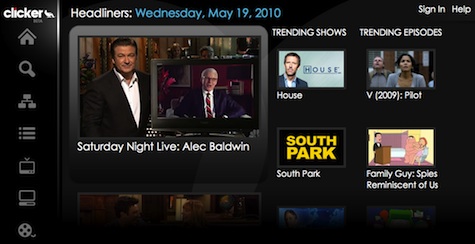
Jim proudly pointed out that while it will feel like you've downloaded a plug-in or an app because of the richness and responsiveness of the site, in fact you haven't; this is the power of HTML5. What you see displayed are four columns. At the left is a tools bar with simple icons prompting search, browse, playlists plus links to display TV shows, web-only shows or movies. In default mode the next 3 columns show "headliners," trending shows and trending episodes. You can rearrange these views via the icons, browsing or setting up playlists.
If for example you see a large thumbnail for "The Hills," when you click on it all the recent episodes are exposed, which you can scroll through with just your arrow keys until finding the one you want and selecting it with the Enter key. Or if you select the movie "The Hurt Locker" Clicker will show you that it's available for download on Amazon and iTunes. If it had been available on Netflix too, you would have been exposed to that option and been able to seamlessly connect and watch at Netflix if you had previously linked your account to Clicker (same way as Netflix works with other devices).
Something else you'll notice is that there's no search bar. So how do you search for a TV show or movie? You simply start typing and your letters appear on screen. It's pretty cool. But in a nod to how different navigation on Clicker is, it offers a handy overlay screen when visiting so you know how to get around.
As Jim put it, Clicker also begins merging the browser and the app worlds (for more on what Google thinks about this idea see, this good post on TechCrunch), and moves the paradigm away from having set-top boxes in order to do robust navigation. Clicker's big opportunity comes as convergence takes off. It's 10-foot UI makes it a natural to be included in various connected devices that are looking to bridge broadband to the TV even as smaller scale version could work really well on mobile devices. In addition, as Jim pointed out, because this is HTML, social and other features can be added easily. The destination is still in beta and it's still pretty early days for Clicker's business model, but Jim sees two opportunities: bounties from aggregators it sends users to and apps that would be created and uphold. Playing around with Clicker you can't help thinking how far the web has now advanced.
What do you think? Post a comment now (no sign-in required).Categories: Technology, Video Search


